Objective
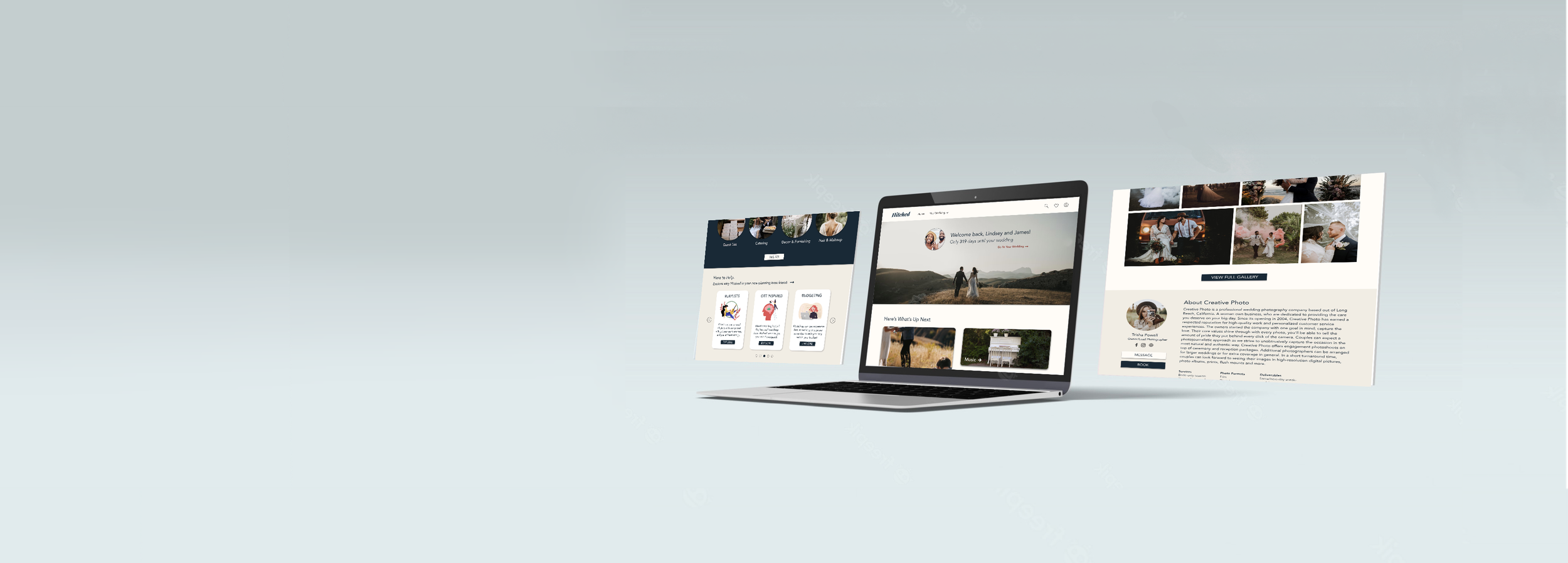
To provide a website alternative to the Hitched App allowing cross-platform date synchronization in order to make wedding planning easy, accessible, and as organized as possible.
Responsibilities
User Research
System Design
Conducting Interviews + Usability Studies
Paper + Digital Wireframing
Low + High-Fidelity Prototyping
Accounting for Accessibility
Iterating on Designs + Responsive Design
Tools
Adobe XD
Team
Solo Project
Duration
April 2022 - June 2022
The Challenge
Individuals planning a wedding ceremony crave organization while having a fun experience. They also often get overwhelmed with the amount of tasks they have to complete.
“How might we detect organizational issues and create a tool that users can utilize to complete their wedding planning? "
The Solution
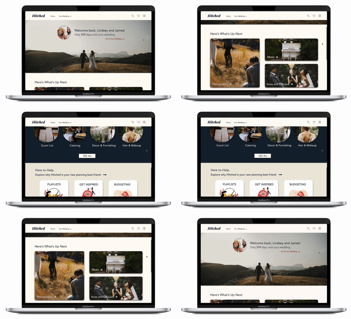
Hitched is a wedding planning website that offers straight forward planning tools that keep users organized and on track. It features a simple and effective task list that shows incomplete tasks, upcoming tasks, and completed tasks. This gives users a visual guide on what they still need to do, and what Hitched suggest the next order of business should be. Hitched also offers helpful hints and tricks for users who are lost, on top of customizable filters and suggested local vendors.
The goal of Hitched is to make wedding planning easy, accessible, and as organized as possible
Key Features
Efficient Task Organization
Custom Filters
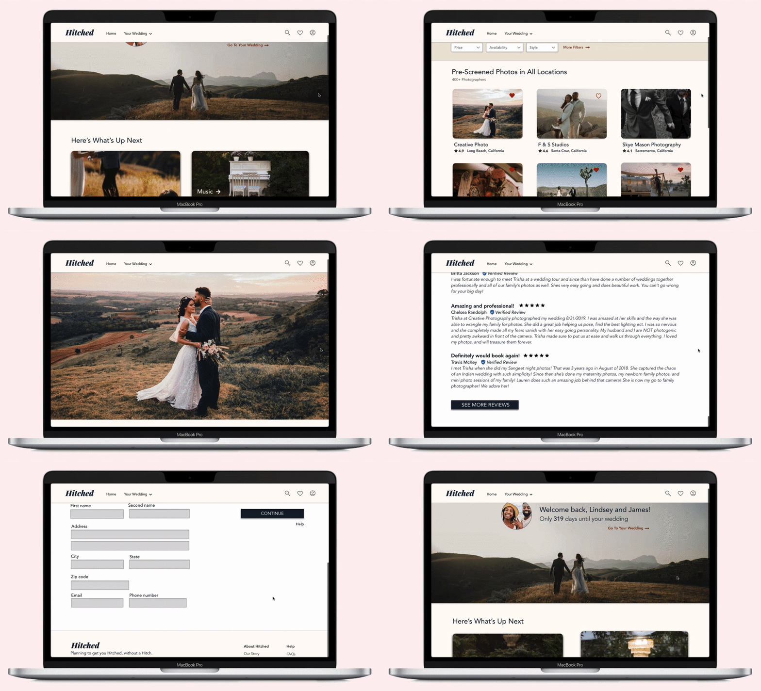
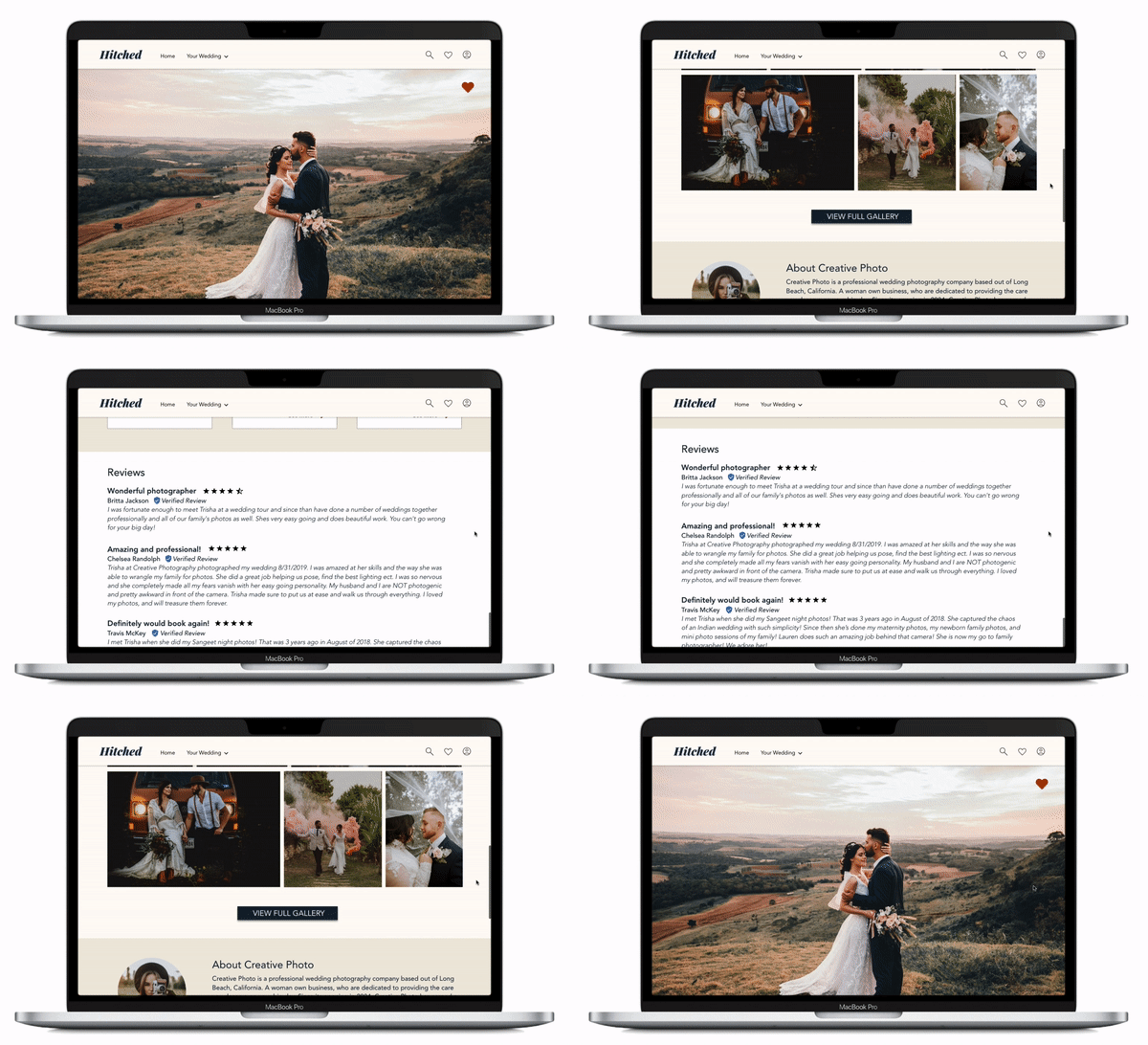
It’s your big day, and you want everyone there to be someone who is rooting for you, especially your vendor staff. Hitched filtered through and hand selected the best of the best, so you know who you’re invited to your party. Easily browse their “About” section, and get to know your new guests.
Helpful Hints and Tips
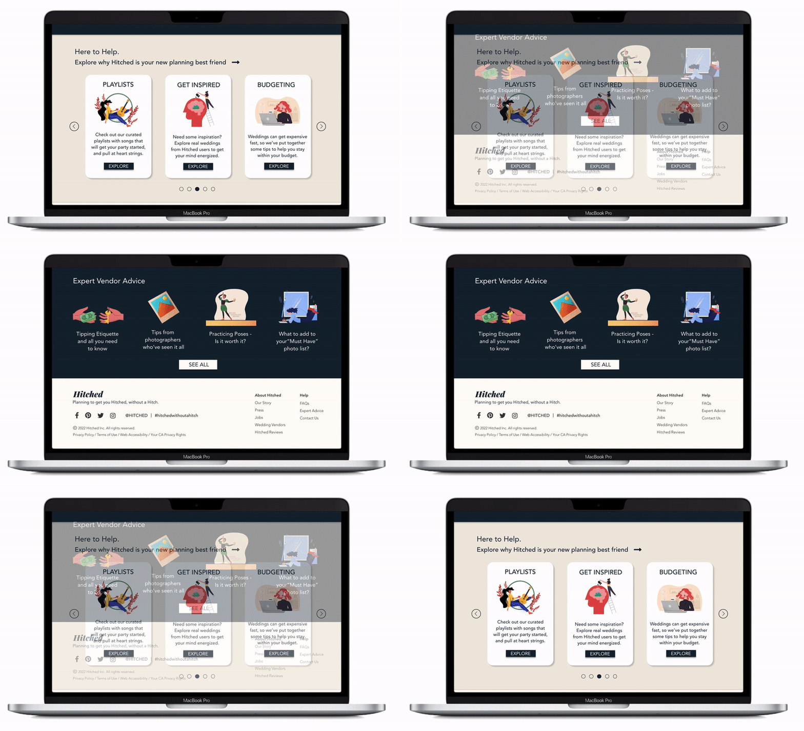
At the bottom of every page, users will find advice curated to the task at hand. Gathered from user surveys, frequently asked questions, and information directly from vendors, every question has an answer. Budget advice and tracking is also available.
With preventing users from becoming overwhelmed in mind, a mindfully designed system of Tasks is featured. On their custom home page, users will find a streamlined and clear list of what is left to do and what they have already done, giving them an encouraging visual on how far they’ve come.
Choosing a vendor becomes an easy endeavor with customizable filters. Users can streamline their search according to their needs with filters for pricing to accessibility requirements. Vendors have been pre-screened by Hitched, an included measure to narrow down the search.
Vendor Pages
Research
Qualitative
Interviews
I spoke to people from diverse backgrounds to understand their pain points of planning.
“I always thought I would plan my own wedding, my friends said they spent A LOT of money on a planner. After looking at planning apps and sites, I don’t think I realized just how much there is to do!”
“I live in a big city, and I feel like everyone and their brother is a photographer these days. How do I know who is actually professional? How many years have they been doing it? Will they be on time?”
“I am notoriously unorganized. My fiance says its because I’m just messy, but I know its my ADHD! I really want to help in the planning, but I want to prove her wrong just to surprise her, you know?”
-Joan S.
Raleigh, NC
-Ken D.
Atlanta, GA
-Annie J.
Richmond, VA
Insights
Often times
individuals are using planning websites to plan their own weddings in order to save on costs
Being able to
verify vendors credentials and view their product is a key component on deciding to book them
Poor organization
habits can be combatted with tools that are specifically catered to a persons needs
1
2
3
Target
Audience
I conducted interviews and created empathy maps to understand the users I am designing for with their specific needs in mind. A primary user group - identified through user research - were brides and grooms planning their own wedding, The typical user is between 26-34 years old, and most users are early-to-mid career professionals.
This user group confirmed initial assumptions about Hitched users, but further research revealed that the enormous amount of tasks needed to complete before the wedding (i.e. booking vendors, etc.) were not the only factors causing the fear of planning one’s own wedding.
An unmoderated user study showed that most people in fact do need advice on the specifics surrounding each task, and a hand-in-hand approach to planning. Creating a one size fits all planning website was kept in mind.
Market Analysis
I did a market study to find similar offerings and studied their value proposition and limitations.
While both products in the market will aid you in wedding planning, they do not offer real world examples, overview of tasks, address accessibility concerns, or offer specific tips and guidance for the task at hand.
www.theknot.com
https://www.zola.com/
“The enormous amount of tasks needed to complete before the wedding (i.e. booking vendors, etc.) were not the only factors causing the fear of planning one’s own wedding."
Initial Design Concepts
Paper Wireframes
Low-Fidelity Prototypes
Moving from paper to digital wireframes made it easy to understand how the redesign could help address user pain points and improve the user experience.
Prioritizing simple task organization and visual element placement on the home page was a key part of the strategy.
I sketched out paper wireframes for my homepage, while keeping the user pain points about navigation, organization, and information in mind.
The home screen paper wireframe variations focus on optimizing the planning organization experience for users.
User Testing
Usability Study: Findings
I conducted two rounds of usability studies. Findings from the first study helped guide the designs from wireframes to mockups. The second study used a high-fidelity prototype and revealed what aspects of the mockups needed refining.
The usability studies provided feedback with a common theme of simplicity.
High-Fidelity Prototype
My hi-fi prototype followed the same user flow as the lo-fi prototype, and included the design changes made after the usability study, as well as several changes suggested from user feedback.
Reflection
Next Steps
Through this process, I learned that even a small design change can have a huge impact on the user experience.
Our target users shared that the design was intuitive with organization, more engaging with the images and categories, and demonstrated a clear step-by-step design to get them to their goals.
The most important takeaway for me is to always focus on the real needs of the user when coming up with design ideas and solutions.
I would like to incorporate the feedback derived from testing into the next version of the prototype, such as-
- Add an area to follow and connect with fellow Hitched users
- Link with Pinterest and offer inspiration boards
- Work with new local talents trying to enter the industry
-Continue assessing accessibility standards
I plan on conducting follow-up usability testing on the new website as well as dentifying any additional areas of need and ideate on those new features


